


To work with Qantas on a brief like this is quite simply a once-in-a-generation opportunity.
There’s a delicate balance that needs to be struck when working on such a revered brand – the need to contemporise it while not straying too far from what everyone knows and loves.
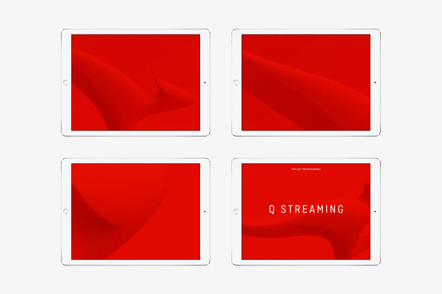
The key opportunity for us was in contemporising the ‘roo. Making it more streamlined, and simplifying the shape. It’s evolved beyond a literal kangaroo – it’s become a unique brand symbol.
It’s been 10 years since Qantas did this. The new identity is truly reflective of the brand we know today. It’s the kind of investment that allows Qantas to compete on a global stage as a leading premium airline.